The Portes-Snowdon bet: 5 years on
SUGGESTED


So Jonathan challenged Chris to a bet over £1,000. Jonathan would win if his forecast turned out to be broadly right (or too optimistic); Chris would win if the forecast turned out the wide of the mark.
But how broad is “broadly right”, and how far is “far of the mark”? The two agreed on a cut-off level of 37%, meaning, the actual poverty rate would have to come within a little over four percentage points of Jonathan’s forecast.
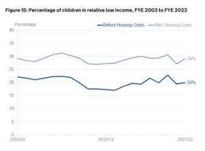
Five years have passed, and the figures are now in: relative child poverty after housing costs in 2021/22 stood at 29%.
This means that Chris wins the bet. I asked both of them for a comment, which they duly provided.
Jonathan Portes:
Why did you get it so wrong? This is a fair question: our predictions of a very sharp rise in relative child poverty (after housing costs) did not materialise. Chris won the bet fair and square.
But to understand why this forecast was wrong, we need to understand both what we were trying to model, and what we were assuming. The point of our forecast was to understand the impact of the government’s proposed changes to taxes and benefits (but mostly benefits, and mostly cuts) on incomes and poverty. So we modelled the tax and benefit changes, and made various assumptions (usually taken from others, like the OBR) on growth in earnings, employment, etc. The results, and in particular our forecast rise in child poverty, were driven mostly by large benefit cuts – most importantly cuts to Universal Credit, as well as to incapacity and disability benefits. The planned cuts we modelled would, according to the OBR, have reduced welfare spending by more than 1% of GDP – well over £20 billion –over the period of our forecast.
Our forecast, therefore, was – as my bet with Chris made clear – conditional on those cuts actually happening. So the first reason it might have been wrong is that the benefit cuts didn’t happen as planned. Indeed, Chris said himself at the time that he didn’t expect them to.
And, in fact, they didn’t. In 2021-22 (the year of the latest stats) the £20/week temporary uplift to Universal Credit was still in force for much of the year, and in addition there were permanent increases to work allowances. Together these restored most of the cumulative UC cuts since our forecast. Meanwhile, the government’s planned cuts to spending on incapacity and disability benefits – as the OBR has described – have simply failed to materialise; indeed, spending has if anything gone up.
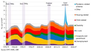
So at a macro level, the planned cuts to benefits that we modelled just haven’t happened to anything like the extent we were modelling. This is shown in the chart below. Instead of welfare spending falling by 1% of GDP, in 2021-22 it was 0.8% of GDP higher than in 2016-17. That’s a difference of about £40 billion.

Can we see this in the actual data on household incomes and therefore poverty? Indeed we can. It shows that the share of income that those in the lowest income groups get from earnings on the one hand, and benefits on the other, has barely budged (Table 2.1db here). The conclusion, then, is that least in 2021-22, the policies we were trying to model were at most only partially implemented; unsurprising, then, that the incomes of the poor did not fall by nearly as much as we expected.
By contrast, Chris’s claim, both then and now, was that the cuts to benefits would be offset by increases in employment and earnings, because “incentives” (that is, if you cut benefits to the poor, they’ll work more and harder). But that’s not what this data tells us. Nor is it supported by the broader employment data, where the overall employment rate hasn’t risen much over the period.
However, Chris has more of a case on his other main argument: that relative income poverty rises much faster if overall income growth, and in particular wage growth, is strong. And he was right that our assumptions on this were considerably too optimistic. Median income growth over the period has been under 1% per year. As a consequence, the relative poverty line didn’t rise nearly as quickly as we forecast.
There are lots of other things going on, but these are likely to be the most important drivers. Chris wins the bet, but not because the modelling was wrong but because – as he correctly predicted, so fair enough – benefit cuts and income growth did not materialise to the extent implied by the official policies and forecasts we were modelling.
So does this mean, as he suggests, that this sort of modelling is useless? Hardly. The fact that cuts to benefits increase poverty, and reversing those cuts reduce poverty, is not contradicted by the data – indeed, the significant fall in poverty in 2020-21 was a direct result of the Universal Credit uplift. Modelling these impacts isn’t just useful, but essential, if you want to understand the impacts of policies. And that if policies aren’t implemented as planned, don’t have the planned result, or other things happen that change those impacts, that doesn’t mean it was a mistake to model them: quite the opposite.
[Note: there are, of course, lots of other things going on that I could have mentioned and that may affect the results: in particular demographic change, changes to survey methodology and response rates, how equivalisation impacts poverty measurement, etc. But I’ve tried to keep this relatively simple]
Chris Snowdon:
When I made the bet with Jonathan Portes in 2018, I remember thinking that I would be a significantly older man by the time it paid off. It is sobering to think about how quickly those five years have passed and how soon the icy hand of Death will be on our shoulder.
Still, it’s the winning that counts. Looking back, my only regret is that I didn’t stipulate that the prize be adjusted for inflation. Thanks to the neo-Keynesian economic policies Professor Portes promotes, £1,000 in 2018 is only worth £828 today.
Forecasts of dramatic increases in poverty and inequality are made all the time. They grab a few headlines before disappearing like tears in the rain. Portes’ prediction that (relative) child poverty would shoot up from 29% to 41.3% per cent by 2021/22 if the government implemented Universal Credit immediately struck me as implausible. The rate of (relative) child poverty (after housing costs) has never exceeded 34% and it hadn’t gone above 30% since 2008, despite endless claims that it was spiralling. After a little negotiation, I agreed to pay him £1,000 if (relative) child poverty exceeded 37% in 2021/22 and he agreed to pay me the same if it didn’t.
To my mind, an increase of this magnitude would require something more drastic than Theresa May’s reforms to the benefits system. If you believe that the Conservative government is determined to grind the poor into the dirt, you will have no problem believing that it would design a system to plunge another 1.5 million children into (relative) poverty. If, however, you think it is run by often hapless but basically centrist politicians whose only unbending principle is that they should be re-elected, you will be more sceptical about this.
The first of these two groups is very large and is particularly vocal on social media. Predictions of imminent doom play well with people who catastrophise everything for a day or two before moving on to something else. If we hadn’t made the bet, everyone would have forgotten about it.
As Portes said at the time, it is important for those who make such forecasts to have skin in the game. He took the bet, which leads me to think that he must have really believed in his prediction. Credit to him for that. But how wrong he was. When the figures for 2021/22 were published recently, they showed that (relative) child poverty (after housing costs) was at 29%, exactly the same as it had been when we made the bet.

This humiliating defeat is particularly awkward for Professor Portes as he has spent the last few years telling me that I know nothing and he knows it all. As you can imagine, this is gratifying for me, not least because it wipes out gambling debts racked up during the World Cup in which I was badly let down by Belgium.
To the handful of lemon-suckers who say it is in bad taste to bet on child poverty, I say that we were not betting on child poverty. We were betting on the validity of economic forecasting. Portes’ prediction was a totem for all economic forecasting, most of which is little better than guesswork and should not be taken seriously. For example, in February, just four months after Liz Truss had to be restrained from ‘blowing’ a £30 billion ‘hole’ in the public finances, the Office for Budget Responsibility admitted that tax receipts were £30 billion higher than it had predicted. This, like all its other terrible forecasts, did not stop people hanging on the OBR’s every word.
As a rule of thumb, the greater the political implications of a prediction, the worse the prediction will be. We saw this with the COVID-19 models in 2021 and we see it with economic forecasting all the time. The pessimism – or, more rarely, optimism – of the authors spills over onto the spreadsheet. The reason the COVID-19 models were wrong is the same reason economic models are usually wrong. They are unable to predict how people behave when incentives change.
At least the COVID-19 models were underpinned with some science (such as mortality rates). Macro-economic modelling is based on essentially nothing. There is no way of knowing what GDP growth will be in 2026 and there is no point in guessing. When insights from the ‘science’ of economics are available, they are often ignored. That is how you end up with the Bank of England in May 2021, having printed £895 billion, forecasting that inflation would hover around 2% for the next three years.
Besides, it was Portes, not me, who was banking on (relative) child poverty rising, and relative measures of poverty are not a good way of measuring material deprivation anyway. Notice in the graph above that child poverty dipped between 2008 and 2011, and again in 2020/21. These were, to put it gently, not good years for the economy and they were not good years for the poor. Relative poverty fell because it is measured as the proportion of households living below 60 per cent of the median income. The standard of living did not improve for people on low incomes in those years. All that happened was the median income fell.
What we saw after the financial crisis is what we are seeing now: wages rising below the rate of inflation while benefits, for the most part, are lifted in line with inflation. If you used relative poverty as your guide, you might think things were getting better. In fact, the best most people can hope for is for things to not get much worse.
The same is broadly true of using income inequality as a measure of progress. Like relative poverty, it tends to go down in the bad times and up in the good times. The irony is that there has been plenty to be gloomy about in the last fifteen years. Productivity, gross national income and wages have risen sluggishly and fitfully. The 2010s were not far off being a lost decade and so far the 2020s have been even worse. It has been a good time to be a doom-monger. The problem is that most of the doom-mongers have focused on the two metrics that have not got worse.
1 thought on “The Portes-Snowdon bet: 5 years on”
Comments are closed.


very informative articles or reviews at this time.