The rich versus the super-rich
16 February 2015
SUGGESTED

Tax and Fiscal Policy
13 February 2015

Government and Institutions

Tax and Fiscal Policy
19 November 2024
Robert Peston, the BBC’s economics editor, has recently made his contribution to the rapidly growing genre of polemical inequality documentaries with the ‘The Price of Inequality’ on Radio 4. As if to illustrate how crowded this field has become, the first episode was immediately followed by a trailer for a programme due to be broadcast later the same day about ‘the split between a rich elite and those said to be hanging on to a deteriorating lifestyle with falling expectations.’
Insofar as it is possible to distinguish these programmes from one another, ‘The Price of Inequality’ was a slightly more upmarket version of the almost comically one-sided ‘How Rich Are You?’ (Channel 4) and ‘The Super-Rich and Us’ (BBC). Although Peston’s documentary included a range of views, he often concluded with sweeping generalisations such as ‘more or less everyone agrees that the very wide gap between the super-wealthy and the rest is bad for pretty much all of us’.
When it came to empirical evidence, Peston had a habit of subtly switching to American data when statistics from Britain failed to support his overarching hypothesis that the rich are getting richer while the poor get poorer. He did at least concede that global inequality has fallen and that an unprecedented number of people have been lifted out of poverty in developing countries, but by the end of the second episode, the programme had descended into a left-wing call-to-arms, with Peston concluding that:
‘The stagnation of incomes of the majority when the tax-avoiding wealthy are scoffing a growing share of the cake means it’s becoming harder and harder pay for governments to pay for the public services we take for granted. The future of the State, or at least as we commonly know it, may depend on closing the gap between rich and poor – on giving hope to the majority that their incomes can and will rise again.’
This apocalyptic view simply does not stand up against the facts. If you’ve read my monograph Selfishness, Greed and Capitalism, the graph below (from the Office for National Statistics) will be familiar. It shows a rise in income inequality in the 1980s that peaked 25 years ago and has since declined.

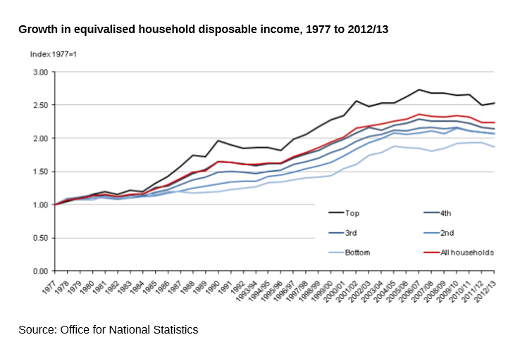
You may also be familiar with this graph – again, from the ONS – which shows the long-term growth in UK incomes for all five quintiles. Of course, this growth halted and fell back somewhat as a result of the financial crisis, but incomes remain around twice as high as they were in 1977 (in real terms) and, as more recent data have shown, they are now rising again.

It seems unlikely that the BBC’s economics editor is unaware of these facts. How, then, can he maintain that inequality is a growing problem which demands urgent action to ensure ‘the future of the State’? The answer is that he ignores standard measures of inequality such as the Gini and 90/10 in favour of focusing on the income and wealth of the top one per cent. Indeed, at one point he concedes that since the early 1990s, ‘it’s really only the top 1% and the top 0.1% who’ve pulled away from the pack’.
It’s easy to forget just how recent is the preoccupation with the incomes of the one per cent, as opposed to the general distribution of income. It was not mentioned in the best-selling book on inequality, The Spirit Level (2009), for example (its authors preferred to use the 80/20 measure), but in recent years Thomas Piketty, Oxfam, Danny Dorling, the Occupy movement and others have put this percentile centre-stage. According to Dorling, in his book Inequality and the 1%, ‘only a tiny number of people – the 1 per cent – can really get rich at the expense of the rest’.
It is not difficult to guess why left-wing writers in the UK have virtually abandoned the Gini coefficient in favour of focusing on the amount earned by the very richest. It is not easy to paint a picture of spiralling inequality when the main measure of inequality peaked before many of your readers were born. But there are problems with this approach, not least the fact that the Office for National Statistics doesn’t collect much data on the one per cent, and figures from other sources are not very robust. Nevertheless, if Thomas Piketty’s income database is any guide, the incomes of the top percentile do indeed seem to have grown faster than most at a time when the Gini coefficient has been flat or falling. In 1990, they had 9.8 per cent of all income. In 2007, they had 15.44 per cent.
This is presented as a problem because the one per cent are, according to Dorling, getting richer ‘at the expense of the rest’. The clear implication from Peston’s programme, and others like it, is that the one per cent’s gains are the 99 per cent’s losses. But this is not what has happened historically and it is not even what happened during the recent recession. Contrary to popular belief, the one per cent’s share of income fell between 2007 and 2011 (from 15.44 to 12.93 per cent).
Let us forget about the Gini coefficient for a moment and see how income is actually distributed. The chart below, again from the ONS, shows the percentage of national income taken by each of the ten deciles since 1990.

The most striking aspect of this table is how little change has taken place over the last 25 years. The poorest five deciles have seen their share of income increase by one percentage point, with the exception of the bottom decile whose share has remained constant at 3 per cent. The richest five deciles have lost one percentage point, apart from the sixth decile which has remained constant and the top decile which has lost two percentage points.
This is hardly indicative of sky-rocketing Victorian inequality. On the contrary, there has been a modest shift in the distribution of income from the richest half to the poorest half. We can argue about whether the current distribution is ‘fair’ or not, but the distribution has clearly become slightly more, not less, equal.
Moreover, we know that even the deciles that are getting the same share of income as they did in 1990 are getting a lot more cash. The median disposable income in 1990 was £16,587 in 2011/12 prices. By 2011/12, despite the recession, it had risen to £23,208, a 40 per cent increase. Five per cent of income in 2015 amounts to a lot more than five per cent of income in 1990. Unless Peston is talking about the very recent past – ie. since 2008 – there has been no ‘stagnation of incomes [for] the majority’.
So what about those in the 1 per cent and the 0.1 per cent who are ‘scoffing a growing share of the cake’, as Peston puts it? Whose slice have they been eating? The table above shows that, even if you imagine that the cake hasn’t been growing, they haven’t been taking from the nine deciles below them. These other deciles has seen their share of income risen slightly. And yet we know – at least we think we know – that the top one per cent has been taking a disproportionately larger and larger share of income, so why hasn’t the top decile become larger? Only two answers present themselves. Either Piketty’s figures for the one per cent are wrong (not impossible) or the one per cent’s increased share of income is coming at the expense of the rest of the top decile.
If we look at Piketty’s figures along with those of the ONS, we can calculate that the one per cent had 10 per cent of income in 1990 while the rest of the top decile had 18 per cent (total: 28 per cent). By 2007/08, the one per cent had 15 per cent of income and the rest of the top decile had 11 per cent (total 26 per cent). Overall, the share taken by the top decile fell slightly, and all the other deciles had the same share as they did before (+/- 1%). Therefore the movement is all within that top decile, with a much larger share of income shifting from the rich to the super-rich.
To be clear, nobody is snaffling anybody’s cake. The cake has been getting bigger for all, including those in the rest of the top decile. But whilst inequality has not risen in the nation as a whole, it has risen sharply within the upper echelons. It is not the richest ten per cent who have ‘pulled away from the pack’. It is is the very rich who have pulled away from the rest of the top 10 per cent. It is, then, the upper-middle classes who may feel that they are having their cake scoffed. If so, it may explain why there is currently such a sense of resentment and antipathy from the wealthy (a group that includes politicians, professors, television presenters and BBC editors) towards the very rich.
This leaves a question for those of us who are in the bottom 90 per cent. So long as the cake is getting bigger and our share of it is not getting smaller, why should we care about the rivalries and resentments of those who earn a lot more than us?

Insofar as it is possible to distinguish these programmes from one another, ‘The Price of Inequality’ was a slightly more upmarket version of the almost comically one-sided ‘How Rich Are You?’ (Channel 4) and ‘The Super-Rich and Us’ (BBC). Although Peston’s documentary included a range of views, he often concluded with sweeping generalisations such as ‘more or less everyone agrees that the very wide gap between the super-wealthy and the rest is bad for pretty much all of us’.
When it came to empirical evidence, Peston had a habit of subtly switching to American data when statistics from Britain failed to support his overarching hypothesis that the rich are getting richer while the poor get poorer. He did at least concede that global inequality has fallen and that an unprecedented number of people have been lifted out of poverty in developing countries, but by the end of the second episode, the programme had descended into a left-wing call-to-arms, with Peston concluding that:
‘The stagnation of incomes of the majority when the tax-avoiding wealthy are scoffing a growing share of the cake means it’s becoming harder and harder pay for governments to pay for the public services we take for granted. The future of the State, or at least as we commonly know it, may depend on closing the gap between rich and poor – on giving hope to the majority that their incomes can and will rise again.’
This apocalyptic view simply does not stand up against the facts. If you’ve read my monograph Selfishness, Greed and Capitalism, the graph below (from the Office for National Statistics) will be familiar. It shows a rise in income inequality in the 1980s that peaked 25 years ago and has since declined.

You may also be familiar with this graph – again, from the ONS – which shows the long-term growth in UK incomes for all five quintiles. Of course, this growth halted and fell back somewhat as a result of the financial crisis, but incomes remain around twice as high as they were in 1977 (in real terms) and, as more recent data have shown, they are now rising again.
It seems unlikely that the BBC’s economics editor is unaware of these facts. How, then, can he maintain that inequality is a growing problem which demands urgent action to ensure ‘the future of the State’? The answer is that he ignores standard measures of inequality such as the Gini and 90/10 in favour of focusing on the income and wealth of the top one per cent. Indeed, at one point he concedes that since the early 1990s, ‘it’s really only the top 1% and the top 0.1% who’ve pulled away from the pack’.
It’s easy to forget just how recent is the preoccupation with the incomes of the one per cent, as opposed to the general distribution of income. It was not mentioned in the best-selling book on inequality, The Spirit Level (2009), for example (its authors preferred to use the 80/20 measure), but in recent years Thomas Piketty, Oxfam, Danny Dorling, the Occupy movement and others have put this percentile centre-stage. According to Dorling, in his book Inequality and the 1%, ‘only a tiny number of people – the 1 per cent – can really get rich at the expense of the rest’.
It is not difficult to guess why left-wing writers in the UK have virtually abandoned the Gini coefficient in favour of focusing on the amount earned by the very richest. It is not easy to paint a picture of spiralling inequality when the main measure of inequality peaked before many of your readers were born. But there are problems with this approach, not least the fact that the Office for National Statistics doesn’t collect much data on the one per cent, and figures from other sources are not very robust. Nevertheless, if Thomas Piketty’s income database is any guide, the incomes of the top percentile do indeed seem to have grown faster than most at a time when the Gini coefficient has been flat or falling. In 1990, they had 9.8 per cent of all income. In 2007, they had 15.44 per cent.
This is presented as a problem because the one per cent are, according to Dorling, getting richer ‘at the expense of the rest’. The clear implication from Peston’s programme, and others like it, is that the one per cent’s gains are the 99 per cent’s losses. But this is not what has happened historically and it is not even what happened during the recent recession. Contrary to popular belief, the one per cent’s share of income fell between 2007 and 2011 (from 15.44 to 12.93 per cent).
Let us forget about the Gini coefficient for a moment and see how income is actually distributed. The chart below, again from the ONS, shows the percentage of national income taken by each of the ten deciles since 1990.

The most striking aspect of this table is how little change has taken place over the last 25 years. The poorest five deciles have seen their share of income increase by one percentage point, with the exception of the bottom decile whose share has remained constant at 3 per cent. The richest five deciles have lost one percentage point, apart from the sixth decile which has remained constant and the top decile which has lost two percentage points.
This is hardly indicative of sky-rocketing Victorian inequality. On the contrary, there has been a modest shift in the distribution of income from the richest half to the poorest half. We can argue about whether the current distribution is ‘fair’ or not, but the distribution has clearly become slightly more, not less, equal.
Moreover, we know that even the deciles that are getting the same share of income as they did in 1990 are getting a lot more cash. The median disposable income in 1990 was £16,587 in 2011/12 prices. By 2011/12, despite the recession, it had risen to £23,208, a 40 per cent increase. Five per cent of income in 2015 amounts to a lot more than five per cent of income in 1990. Unless Peston is talking about the very recent past – ie. since 2008 – there has been no ‘stagnation of incomes [for] the majority’.
So what about those in the 1 per cent and the 0.1 per cent who are ‘scoffing a growing share of the cake’, as Peston puts it? Whose slice have they been eating? The table above shows that, even if you imagine that the cake hasn’t been growing, they haven’t been taking from the nine deciles below them. These other deciles has seen their share of income risen slightly. And yet we know – at least we think we know – that the top one per cent has been taking a disproportionately larger and larger share of income, so why hasn’t the top decile become larger? Only two answers present themselves. Either Piketty’s figures for the one per cent are wrong (not impossible) or the one per cent’s increased share of income is coming at the expense of the rest of the top decile.
If we look at Piketty’s figures along with those of the ONS, we can calculate that the one per cent had 10 per cent of income in 1990 while the rest of the top decile had 18 per cent (total: 28 per cent). By 2007/08, the one per cent had 15 per cent of income and the rest of the top decile had 11 per cent (total 26 per cent). Overall, the share taken by the top decile fell slightly, and all the other deciles had the same share as they did before (+/- 1%). Therefore the movement is all within that top decile, with a much larger share of income shifting from the rich to the super-rich.
To be clear, nobody is snaffling anybody’s cake. The cake has been getting bigger for all, including those in the rest of the top decile. But whilst inequality has not risen in the nation as a whole, it has risen sharply within the upper echelons. It is not the richest ten per cent who have ‘pulled away from the pack’. It is is the very rich who have pulled away from the rest of the top 10 per cent. It is, then, the upper-middle classes who may feel that they are having their cake scoffed. If so, it may explain why there is currently such a sense of resentment and antipathy from the wealthy (a group that includes politicians, professors, television presenters and BBC editors) towards the very rich.
This leaves a question for those of us who are in the bottom 90 per cent. So long as the cake is getting bigger and our share of it is not getting smaller, why should we care about the rivalries and resentments of those who earn a lot more than us?

12 thoughts on “The rich versus the super-rich”
Comments are closed.
SHARE


Very useful piece, Chris. I like Robert Peston, but you are right to suggest that he will be among the rich who seem to resent the super-rich. Paradoxically he will suffer from measures to screw more money out of those at the top. On his salary he will be paying the revived 50% tax rate, while his house in Muswell Hill will probably attract the mansion tax. So he’s being altruistic, I guess.
It always cheers me up to see an optimist in action. Chris Snowdon is indeed an optimist if he thinks that providing his intellectual opponents with facts about real levels of income and income shares will make the slightest bit of difference.
Interesting piece. However, there is a lot of data but not all of it is referenced. For example: “Contrary to popular belief, the one per cent’s share of income fell between 2007 and 2011 (from 15.44 to 12.93 per cent).”. There is no source referenced for this figure. Where does this come from and to where does it apply – just the UK or the world?
HJ, it’s from Thomas Piketty’s income databse, with link in the previous paragraph.
I find it extremely worrying that the BBC’s Economics Editor seems willing to give credence
to such simpliste statements about the recent evolution of income distribution in the UK as:
‘the tax-avoiding wealthy are scoffing a growing share of the cake…it’s becoming harder and harder
for governments to pay for public services…’. This is not serious economic, and politically-unbiassed,
reportage; as your blog-piece has so clearly exposed.
This matter is very important, because the majority of our voters are not entirely clued up on
Gini coefficients (etc); and often do rely also, to some extent, on (supposedly) “unbiassed” reportage from public-service news providers such as the BBC and Channel 4 for some instruction on such complex
matters.. which should be bereft of both ideological slant and misreportage.
I think Robert Peston (and/or his senior managers) should reply formally about these matters,
in a statement issued to the IEA and publicly.
Great article, most of which I agree with wholeheartedly. My only question is over the remark you end the article with. This is, “So long as the cake is getting bigger and our share of it is not getting smaller, why should we care about the rivalries and resentments of those who earn a lot more than us?”
I agree with this, but wonder what your opinion is of a situation where the cake is getting bigger overall, but for many the share is getting smaller, or at least not rising. In America, I think I’m right in saying that median incomes have stagnated in recent decades. In light of this, and if your piece was a USA-centric one, would your conclusion change? If everyone’s income is rising, but inequality is rising, this is not as contentious as a scenario where inequality is rising AND some people’s incomes are stagnating.
Excellent piece, but I have two questions: (i) Are your ONS decile distributions pre- or post-tax and benefits ? Looking at the numbers, my strong guess is pre. However left-leaning you are, surely what is important are post-tax and benefits incomes, since only in a planned economy is a Government able to determine pre-tax incomes. My second question, which I guess is too big to tackle here, is why the top 1% are moving up so strongly in income share? If it is globalisation and technological changes to production (which is my guess), then no Government can change that – so we had better stop moaning and find a way to live with it.
I couldn’t care tuppence about inequality. What does it matter to me or my neighbour if a handful of Bransons or Gateses get richer, or a bigger share of global income, or whatever?
I care about my standard of living, for which I am grateful. I care, not quite as much, about other people’s standard of living.
But this is what I think:
1. that if all we care about is getting richer, we will not achieve anything worth having.
2. that our need for good social relationships is far more important than inequality or so-called poverty.
Let’s shut up about money and talk instead about good schools, good healthcare, good communities, good culture, good living. Let’s talk instead about values.
Good piece. A couple of queries:
– Don Boudreaux (or maybe the other dude at Cafe Hayek, I forget…) consistently bangs on about changes in composition of households, in particular household size. Does this have any implication for the data you present? Presumably lower strata divorce/ fecklessness rates and assortative mating in the upper tiers means that it could even rosier than you suggest.
– How are incomes adjusted for? It strikes me that a large amount of the resentment towards the 1 percent/ “the rich” is influenced disproportionately by London property prices. It’s easy to feel very poor in London on a relatively decent salary given inherited expectations of property and location. Is there any methodology to attempt a regional scaling of income share to better reflect costs? Anecdotally, my old man picked up a three bed terrace in Highbury on a median salary having been bunged the same again in 1982 by a local council worried about dilapidation in the housing stock, whereas now the same could possibly purchase a one bed flat two zones further out with no easy money from local apparatchiks. .
Neil, the figures are for disposable income so they are after benefits and income tax, but before indirect tax. I agree that globalisation is a big factor for the increased share going to the top 1% and top 0.1%.
Little Tripoli, the figures are equivalized so they are adjusted for household size.
The maths doesn’t work with Picketty’s and ONS numbers together. Picketty’s top 10% figure for 2007 is 42%, the ONS is 15%, so comparing Picketty’s top 1% figure to the ONS top 10% is not going to yield useful results.
I suspect Picketty’s figure is a pre-tax, pre-benefits figure.
Anon,
That is a good point. Piketty’s figures do seem to be very different from the ONS’s. There is, however, other evidence that the top 1% and top 0.1% are pushing away. The IFS, for instance, finds that the 99/90 measure has been rising since 1994 whereas other measures of inequality have not.